Graphic Design
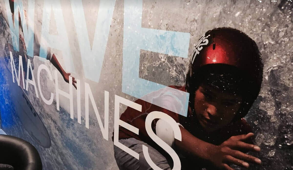
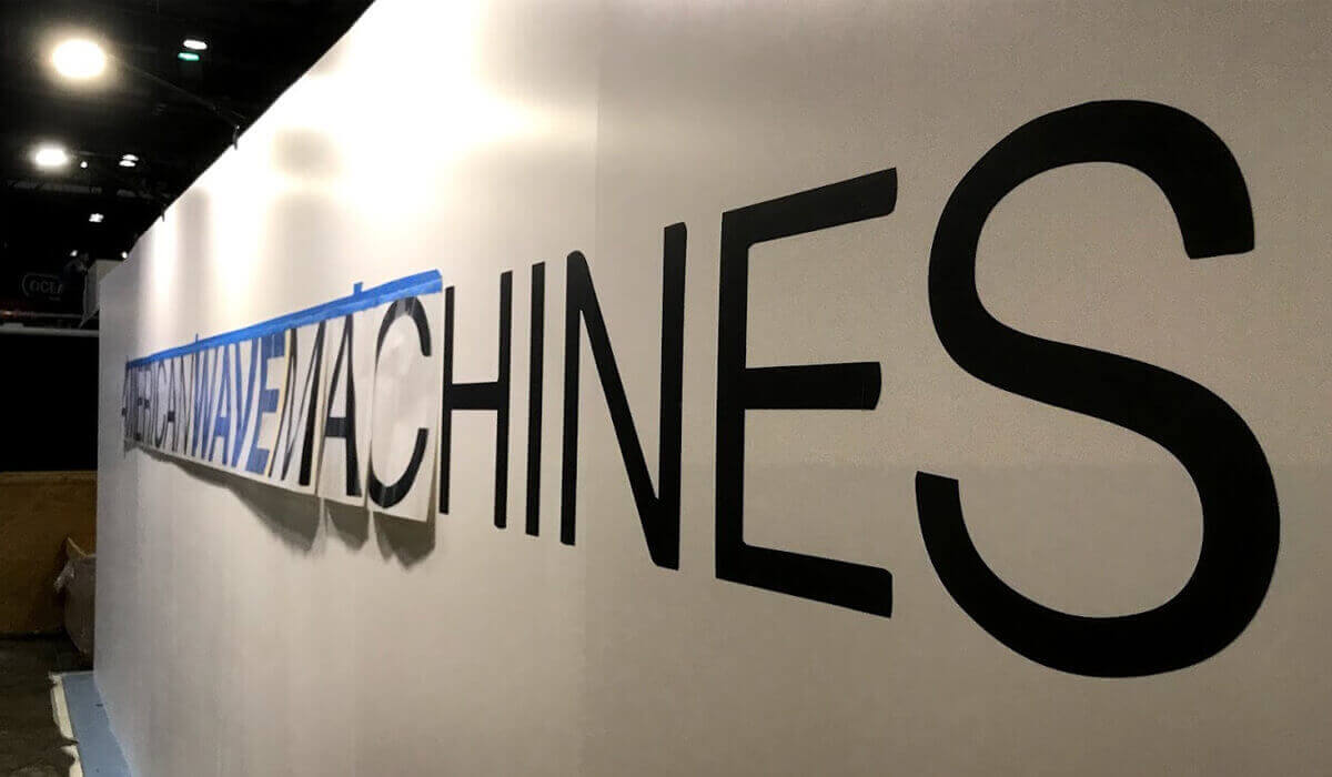
Graphics make the booth, especially with the advantage of today’s printing capabilities. Naturally you want your graphics to look great and deliver memorable branding and a clear message.
You want your graphics to guide and educate without overwhelming. We understand this, and know what stands out on the show floor and what may be overlooked. More than anything, we’re able to think in 3D and develop graphics that look great, wrapping around booth contours and spanning surfaces.
We work with you to develop print ready art files. We provide Graphic Design service and charge by the hour. You provide your images, colors and copy and we’ll take it from there. If additional images are needed, we have great resources to get just the right one.
In the end we’ll deliver 2D graphic proofs along with 3D rendering views of your booth with your graphics applied. These are your art files to own and use in any future marketing project.


Our Exhibit Designers are also Graphic Designers
We make graphic design easy for you with our many years of experience designing eye-catching booths. We help your logo and message come to life with our design techniques and high-quality graphics printing. Every company’s needs are different, let us show you some ideas and if they don’t work for you, we’ll try again. We strive to give your brand a look that you’ll love. Contact us to get started.
- Unlimited Revisions
- Vector Art Conversions
- HIgh Quality Printing
- Decades of Trade Show Graphics Experience and Advice

Ask Us a Question
FAQ's
How much should we expect to pay for the graphic design needed for a booth?
Since graphic design is billed on an hourly basis the total you’ll pay will depend on how smoothly the graphic development goes.
It’s a creative process and for even highly experienced designers some projects come together quicker than others
Another factor will be the number of revisions that are involved. For example if the designer is not clear on the requirements and you don’t like what they propose in their concepts it will take more hours to develop more concepts. Typically it’s revisions or changes during the creative process that significantly increase the hours and the cost
However things will be much easier if you have what is called a style guide or brand guidelines created by a designer for your company that has systematically identified how your logo will be used in different situations and your specific color combinations and secondary fonts that sort of thing.
And even more easy if you’ve used the style guide and branding guidelines to develop a beautiful website. It’s our experience that companies with a beautiful website can’t expect a designer to develop complementing Booth graphics fairly easily as long as you’re able to provide high-quality images and vector art.
What if we just need help preparing print ready files?
Sure this is no problem for almost any designer.
If you’re using Adobe illustrator or Adobe Photoshop then chances are every designer you talk to including ours can work with your files to create the print ready art files that go to the printer.
Keep in mind, print ready means that the document needs to be the proper height and width and the photographs need to have good resolution.
If your document was not built very close to its final size then making the final changes might involve some modifications to your layout so that your graphic elements fit properly.
This would involve more time because You may not be happy with the changes that will be required by rearranging and resizing your graphic elements.
And worst case scenario this could Involve a significant redesign of your trade show booth graphics.
We are worried about color matching. Are you able to match our PMS colors exactly?
This is a tricky area and it’s very easy for any company to tell you yes that it’s simple to print exact match of a PMS color. But this is simply not the case, PMS colors or Pantone colors are solid colors. The first thing to recognize is that you really can only match a PMS color in your graphic if the color is solid.
Many graphics instead have a blend or a gradient which would not be able to match to a PMS color code.
The best way to approach this is to consider that most people are generally trying to match the solid color of their logo for example a blue. And possibly that same blue is used in the graphic blended in a gradient. If the printer focuses on matching the solid blue of the logo then the blue in the gradient will be complementing.
If your graphics are complex with a lot of gradients or images and it’s highly important to you that they are true to the correct colors then the best plan of action is to pay a little extra money for a swatch print. This requires a little bit more advance time since the printer will take a small portion of the graphic and print it on the actual material and send it to you FedEx. It’s a small fee and always a good idea. However many companies waste time in the graphic development and lose the few days needed to print, ship and review a test swatch. Don’t find yourself in that same situation.
Many subtle factors can influence the final look of a color on a printed item. For example printing on Sintra then printing on fabric will yield different look, even if the same machine was used in the same ink. It’s also important to keep in mind that printing is very much a science but still it is a bit of an art. Colder days in the print shop will give a slightly different color then warmer days.
The last thing to note is this. When you ask the printer to match a PMS color code, they will make adjustments to the printer and run a small test print and compare that to the PMS color book. The PMS color book they will reference has both flat and gloss for every PMS color.
These colors are printed on card stock which is different than the material they are printing on for your trade show booth graphics. The test may appear very close and within acceptable range to the printer but it could to you look for off once the full-size image is printed and the printed graphic installed on your booth under trade your lighting. It’s best to plan your graphics to look good and allow for slight shade differences and order a test strip to make sure you will like the colors and image detail.
Remember, chances are you and the designer would be able to recognize a slight difference but on the show floor no one else would think twice about it.
What software do you use to create your trade show booth graphics?
The industry standard and the software that we prefer are the Adobe suite of graphic software‘s that include Illustrator, Photoshop.
Photoshop is primarily used to manipulate or change or improve pixel based photos. All digital photographs are pixel based.
The art board that defines the size of your graphic is created in illustrator. Illustrator is excellent because it is a vector-based graphic software. Vector graphics can be a confusing concept but a simple short explanation is that vector graphics all have a mathematically determined smooth perimeter. A circle is a perfect circle no matter how close you zoom up on it.
The beauty of vector base graphics are that they can we made small on the computer then enlarged huge for printing without any loss of quality. The perimeter will be just as razor sharp on the side of a building. So because vector graphics give you this razor sharp crisp edge most designers will use vector fonts for your text on your graphic.
The basic steps are not Overly complicated. first the art board size is entered and a background color Is selected or pattern is created.
- Next the digital photos from Photoshop are imported and placed.
- Then the Font is selected and the text is typed, sized and colored
- Then small adjustments are made to perfect the graphic then can be ready to go to the printer.
One obstacle is worth noting here. Trade show graphics are very often huge. Illustrator has a limit to how big you can make the art board, 227 inches. So if the printed graphic will be larger than 227 inches the designer will do the math so that they can build the art at 50% of the final print size planning that the printer will scale it up to 100% before printing.
This scaling has no effect on the quality for the vector objects which typically include the background and the logo and the font. However the designer needs to plan for the pixel-based digital images two double in size and still retain acceptable quality.
What is deemed acceptable quality in an enlarged photographed is a little subjective, however here are the guidelines. Some images can simply enlarge better than others. The detail in some images or the contrast in some images make any imperfections stand out. Whereas some images when enlarged it’s very hard to tell the imperfections that appear on and images enlarged
The printer will preview the art files looking for pixilation issues which is in effect that makes parts of your image look like a bunch of small colored squares. The printer will also look for images that look blurry when enlarged. This could be a result of slight out of focus when the image was taken and the problem amplified when the images enlarged.
It’s not uncommon for us to go back to our clients and provide screenshots that show the pixilation and blurry areas of the art file before printing. If this involved your art file, you would have a choice to either provide another higher quality image to use or to except the minor flaws If they feel they are insignificant.
Is it cheaper to use cut vinyl graphics?
We find that cut vinyl graphics in some situations save money and allow you to perfectly place text or logos after install to insure optimal placement. This can be be helpful above or below a wall mounted tv for example.
Beyond a certain size, opting for vinyl graphics can be time-consuming and difficult to apply printed vinyl to a panel. The money saved by not printing a full wall panel is spent in extra labor required to apply the complex vinyl graphic onto the panel.